Fifty Fifty
Logo, identity and communication materials for Fifty Fifty, a London-based post-production agency.
When we’re involved in corporate identity work, sometimes it’s the idea for a logo which comes first and the identity follows on, and sometimes it’s an idea for the identity which drives the logo. In the case of this project it was definitely the latter.
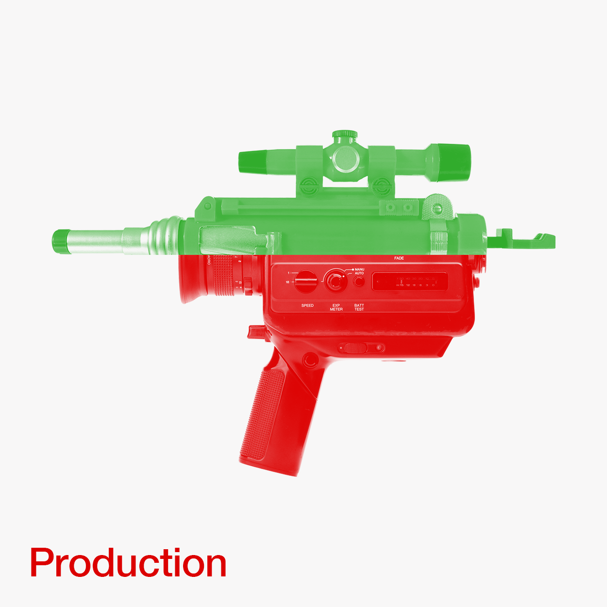
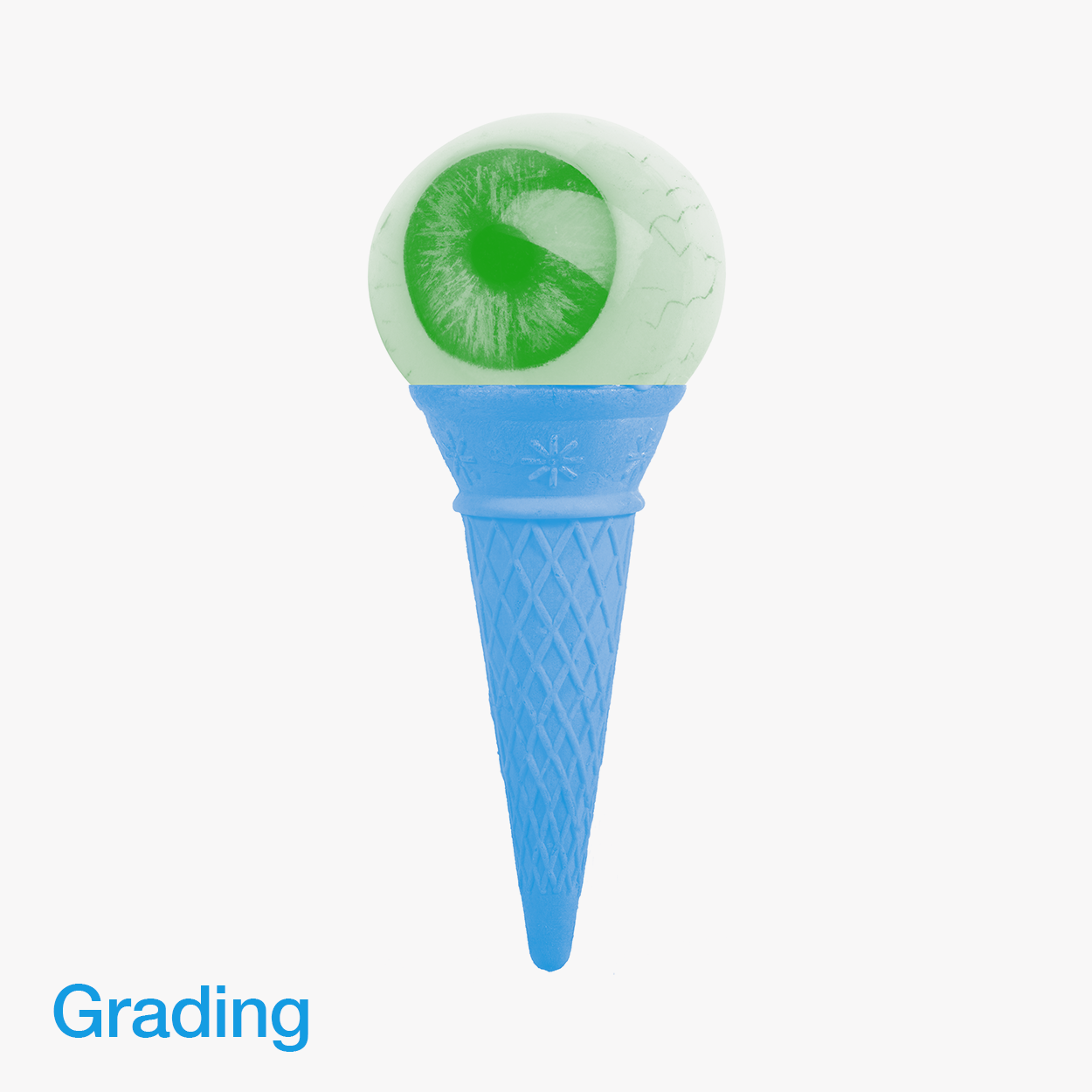
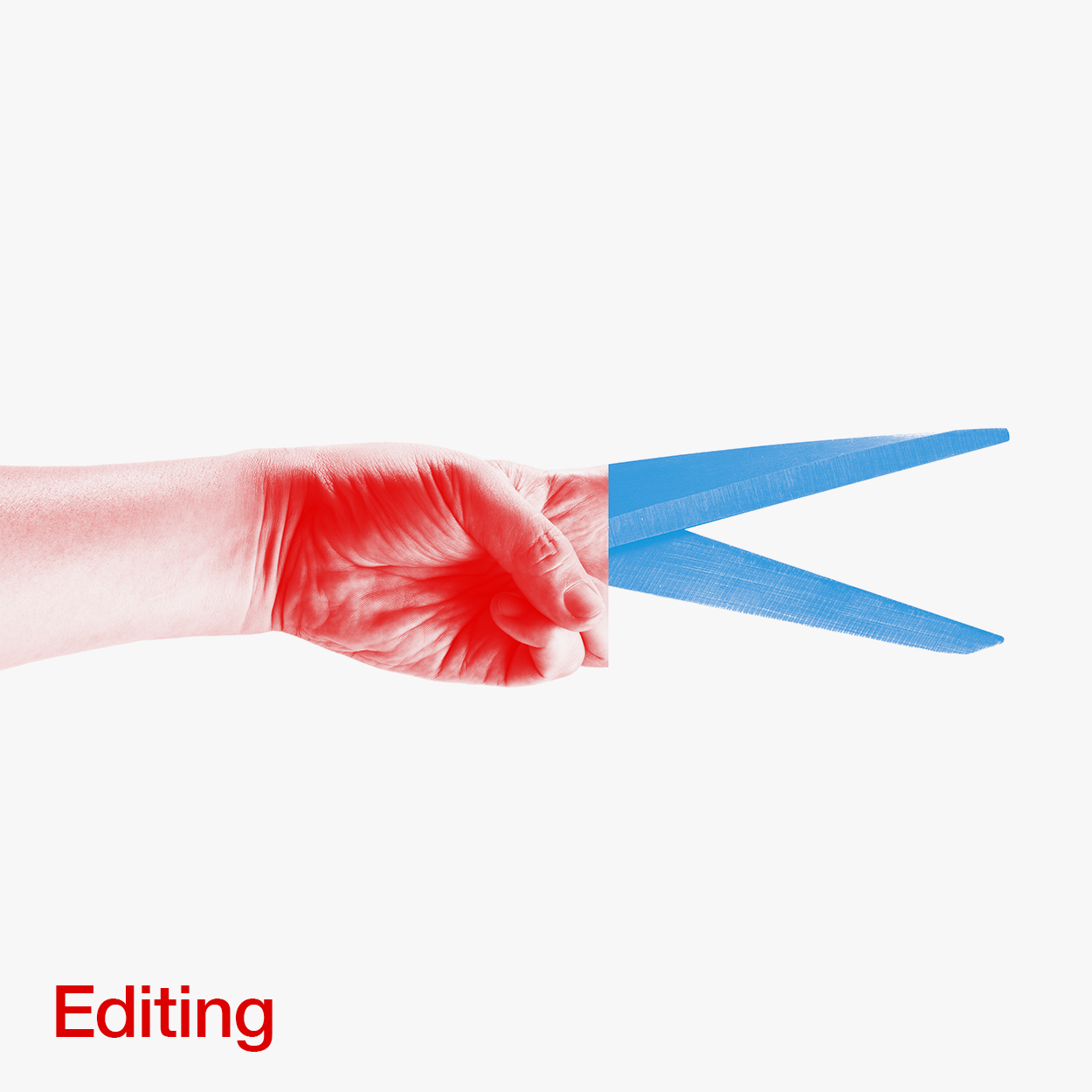
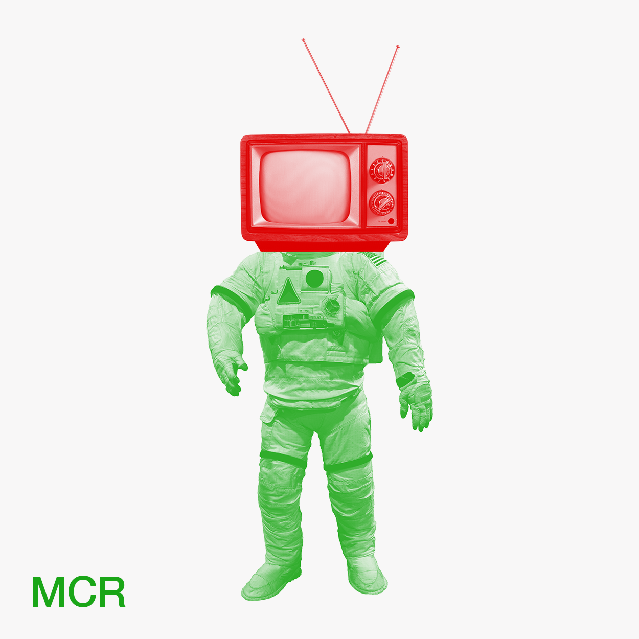
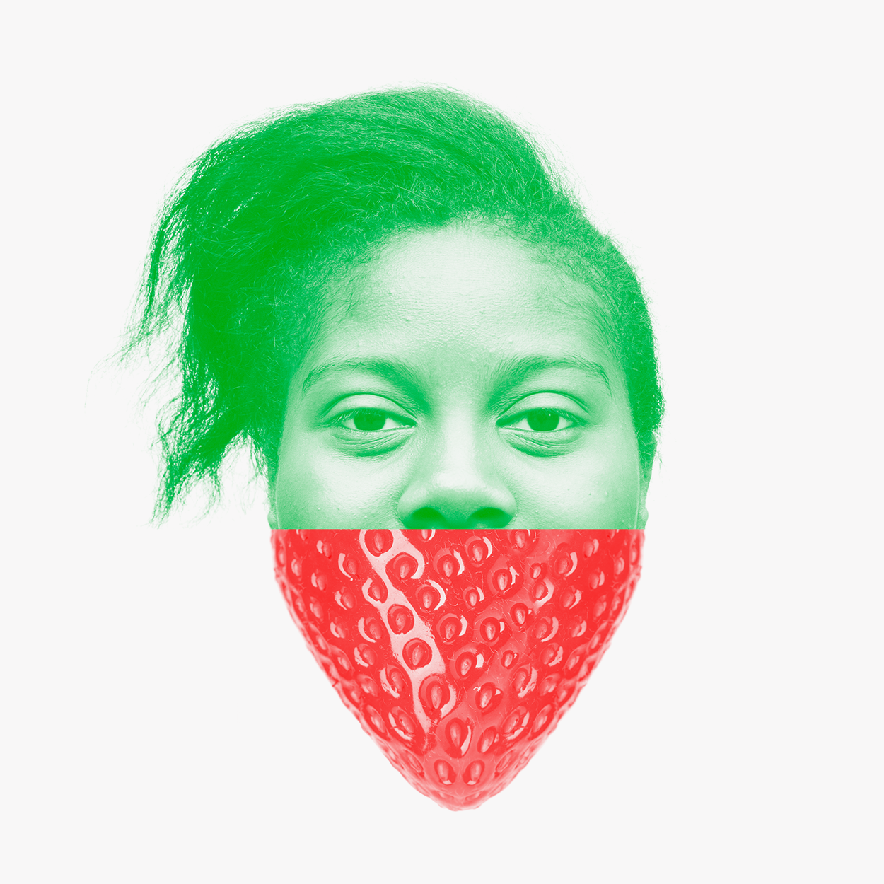
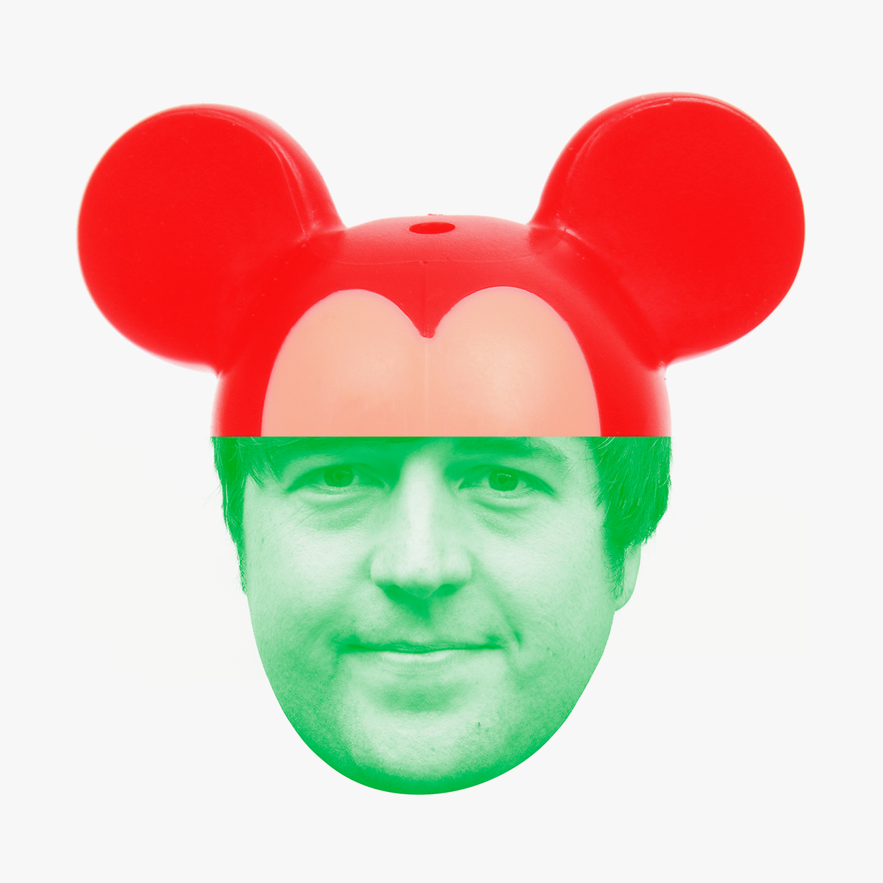
The visual identity centres around a playful and often amusing set of composite images. The images loosely relate to the variety of work they do, and ties in conceptually with the process of editing, the RGB colour spectrum intrinsic to the industry, and of course, the company name Fifty Fifty.
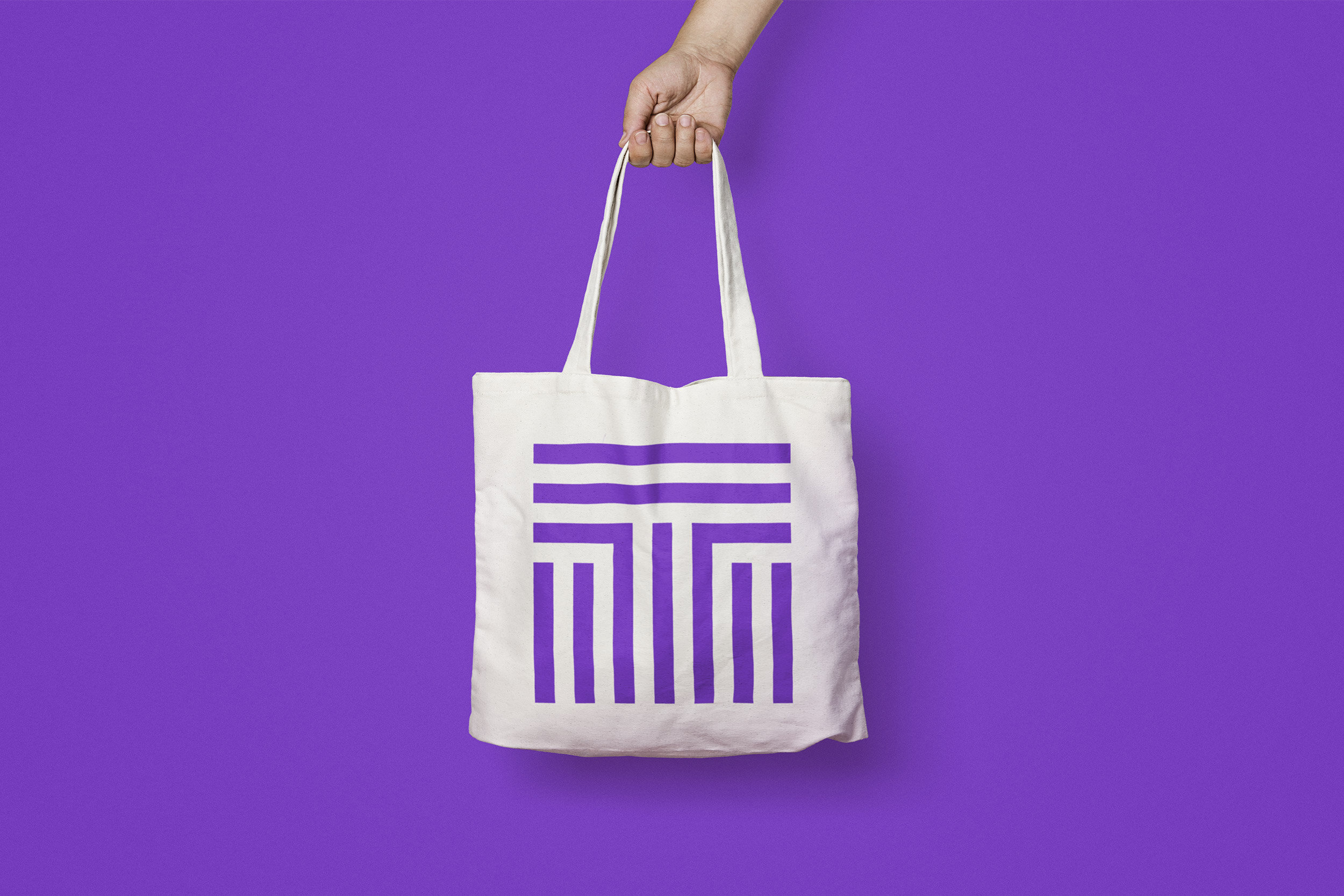
To best complement this, we created a clean and simple logotype which appears in the three colour versions of red, green and blue. This gives the client the ability to choose the most appropriate colour-way to complement the accompanying image.
As part of the project we created a whole host of useful materials such as business cards, labels and inserts, email signatures, internal and external signage, a simple set of styalised maps, and a website.
What I was really impressed with was not only the ease of the design and approval process, but also their project management and client care; we didn't have to think about a thing. We were impressed with their design skills from the word go – not least because they were right up our street which demonstrated a clear understanding of the brief and of us as a client – after just the one meeting. Cara Kotschy Managing Director, Fifty Fifty


Recent work